
CaribSys
The site for a data infrastructure company based in Castries, Saint Lucia, working across the Caribbean. Most of the people reading it are CIOs and procurement leads working out whether to shortlist a regional company, and it is put together with that one reader in mind. The coverage map is the centerpiece.
Overview
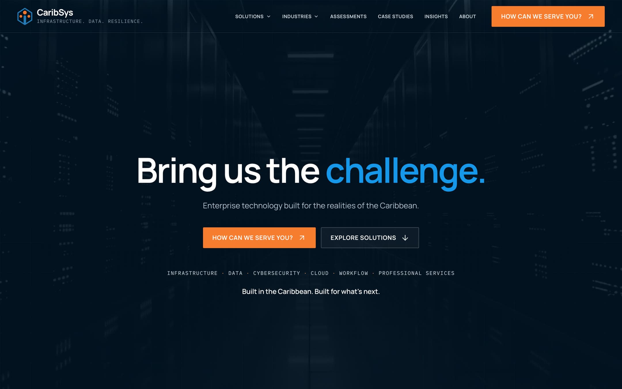
CaribSys designs, installs and looks after data infrastructure from Suriname and Guyana, up through the Antilles, as far north as Turks & Caicos. What they had online was a placeholder rather than a website, so the job we were handed was the whole story: why the company exists, what it actually sells, and the fact that it covers the region rather than saying it does. The other half of the brief was that the site should be something you move through instead of something you read, and that is where most of the build went. Next.js underneath, Motion for the component level animation, anime.js for the sequences that write straight to the DOM, like the count-ups and the line drawing itself across the map, and Lenis so anything tied to scroll has something smooth to read from. The map geometry is projected with d3-geo off Natural Earth coastlines. Search was part of the build rather than something added at the end. Every route is prerendered with its real content sitting in the HTML, each one carries a title and description written for that page instead of one repeated site wide, and because the words arrive in the response rather than getting assembled in the browser, an answer engine can quote a page as readily as a crawler can index it.
What We Did
The coverage map
Coverage is the first thing anyone checks, so we projected the map from Natural Earth coastlines instead of drawing it. Each node sits at the real latitude and longitude of the city CaribSys works out of. The line running through them is one continuous spline. We tried joining arcs first and every market came out as a kink. Hovering, tapping or tabbing a node fills the panel on the left with that market's priority sectors and what the local industry is built on. Click one and it stays selected, and the slug goes into the URL, so the sales team can send someone a link that opens on their own country. The markets, coordinates, sectors and copy all sit in one typed module the map reads from, which is why adding the Cayman Islands a few weeks in was a data edit rather than a change to the component.
Two pieces of motion, used everywhere
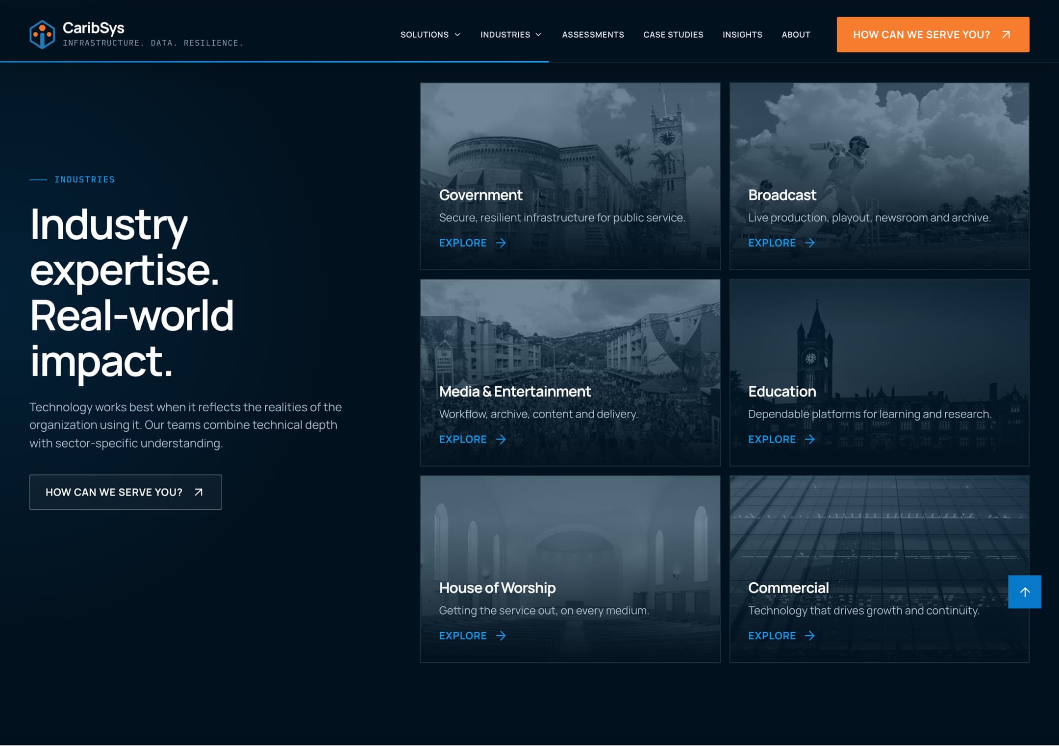
There is not much movement on this site and that is deliberate. Things arrive with a short blur and rise, headings uncover a word at a time, and that is about it. Give every section its own entrance and the page starts to feel like a showreel. The industry grid blurs the cards you are not pointing at, page changes happen behind a five panel wipe, and anyone with reduced motion turned on gets the finished state with the smooth scrolling switched off too.
Their story, out of one interview
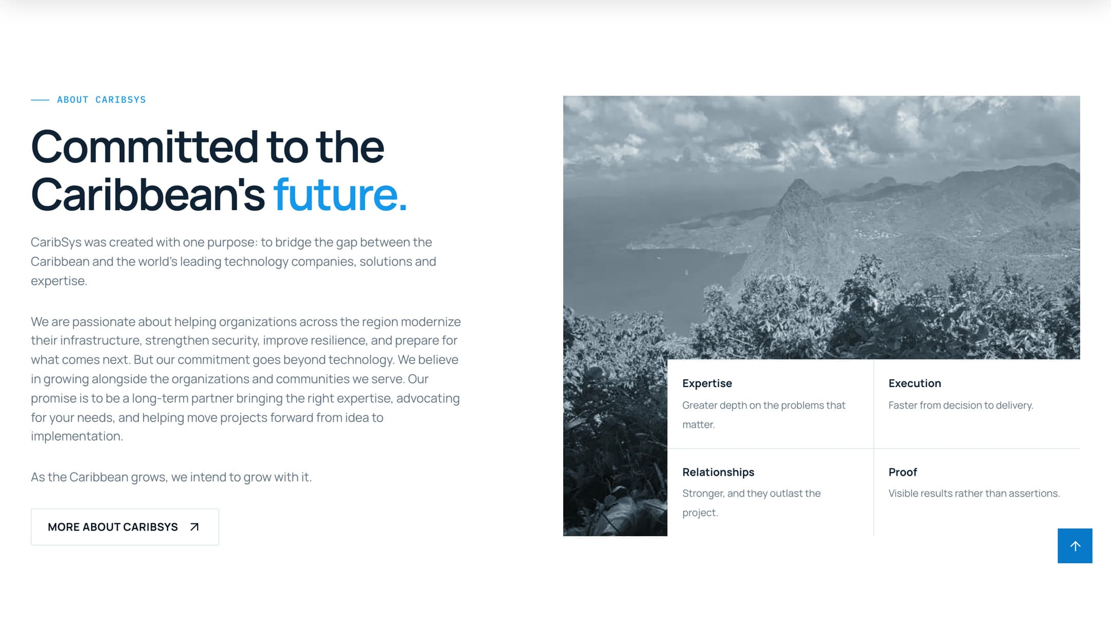
There was no team photography, no pictures of the facilities, and nothing written down anywhere that explained the company. So the About page came out of a single long call: why CaribSys exists, the gap in the region they set out to close, how a project runs from the first conversation through to support afterwards, and what they intend to still be doing in ten years. Five themes, one interview, then a page that sounds like them rather than like a technology company in general.
The pages that repeat
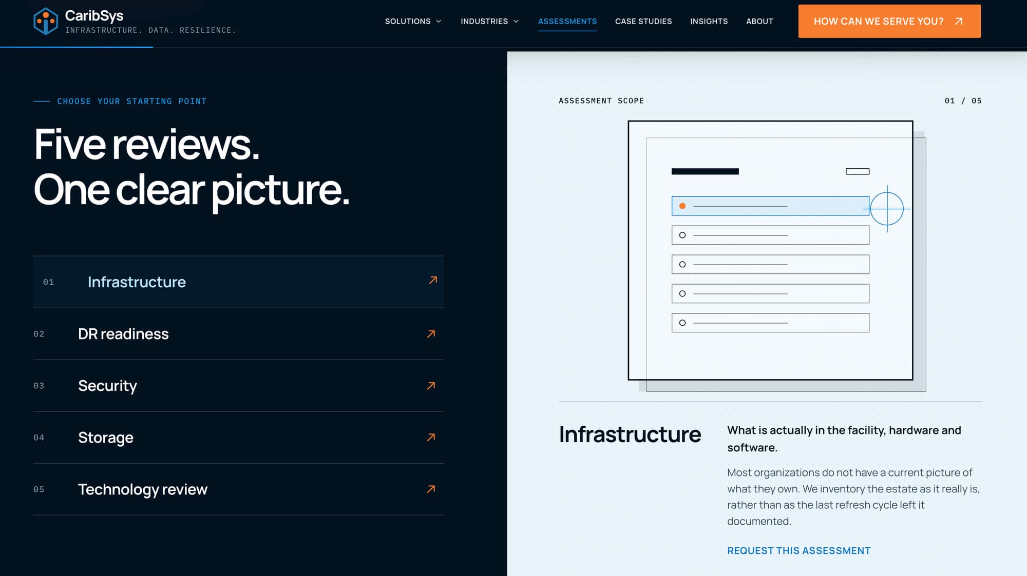
Solutions, industries, case studies, insights and assessments are five families of page that all work the same way. Each has an index and a template, and both read the same record out of one typed content module, so a card and the page it opens cannot drift apart. Assessments is the one in the picture: five reviews listed by name, each with a line on what it looks at and a paragraph on what usually turns up, so someone can point at the one they want instead of writing out a description of their problem. With no photography to work with, the panel beside the list is a drawn report that redraws as you move down.
Where every button ends up
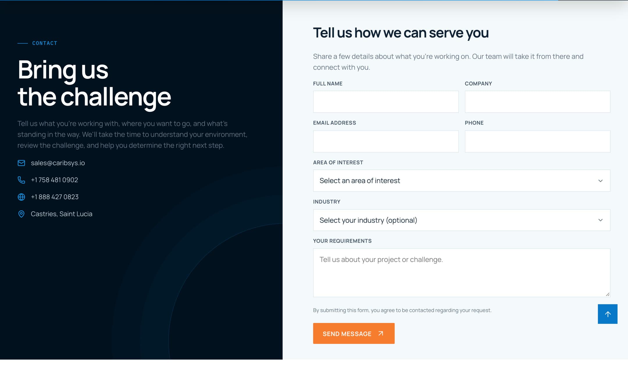
Every call to action on the site lands on the same form, and that form's whole job is to put a readable email in sales@caribsys.io with the sender set as the reply-to, so answering it is just hitting reply. It goes out through Resend on a dedicated sending subdomain rather than the main domain, so if the form ever gets hammered the reputation at risk belongs to a subdomain and not to the address CaribSys does business from. Anything that ends up in a mail header is cleaned on the way through, and the area of interest is checked against the list the form itself offers rather than trusted as typed.
Handing it over
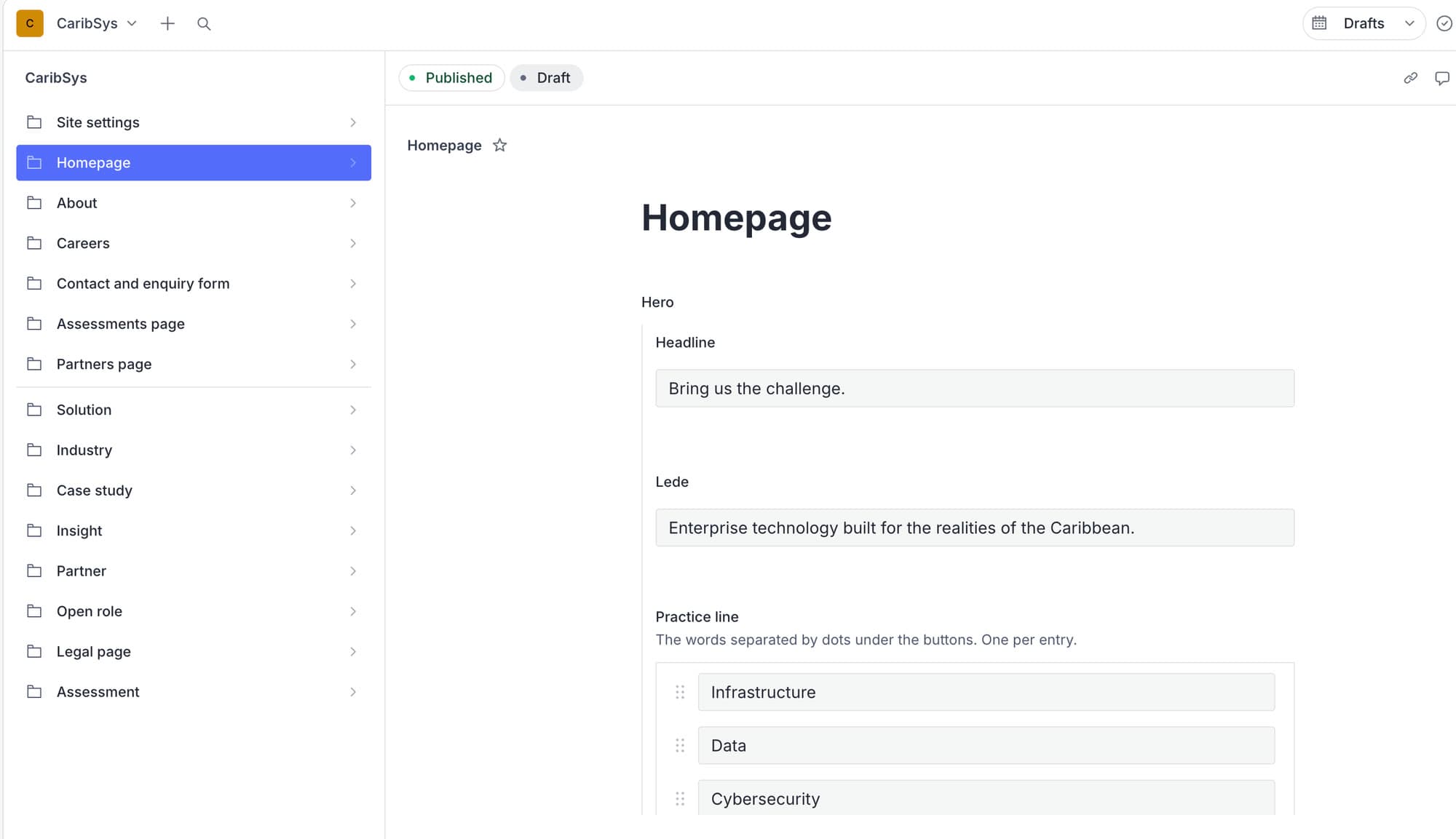
The accounts are all CaribSys's. Headers, redirects and build settings live in the repository instead of a hosting dashboard, because anything in the repository comes with them if they ever move. Content went into Sanity the day before launch, so the wording on any page is theirs to change now and it is live a couple of minutes later.